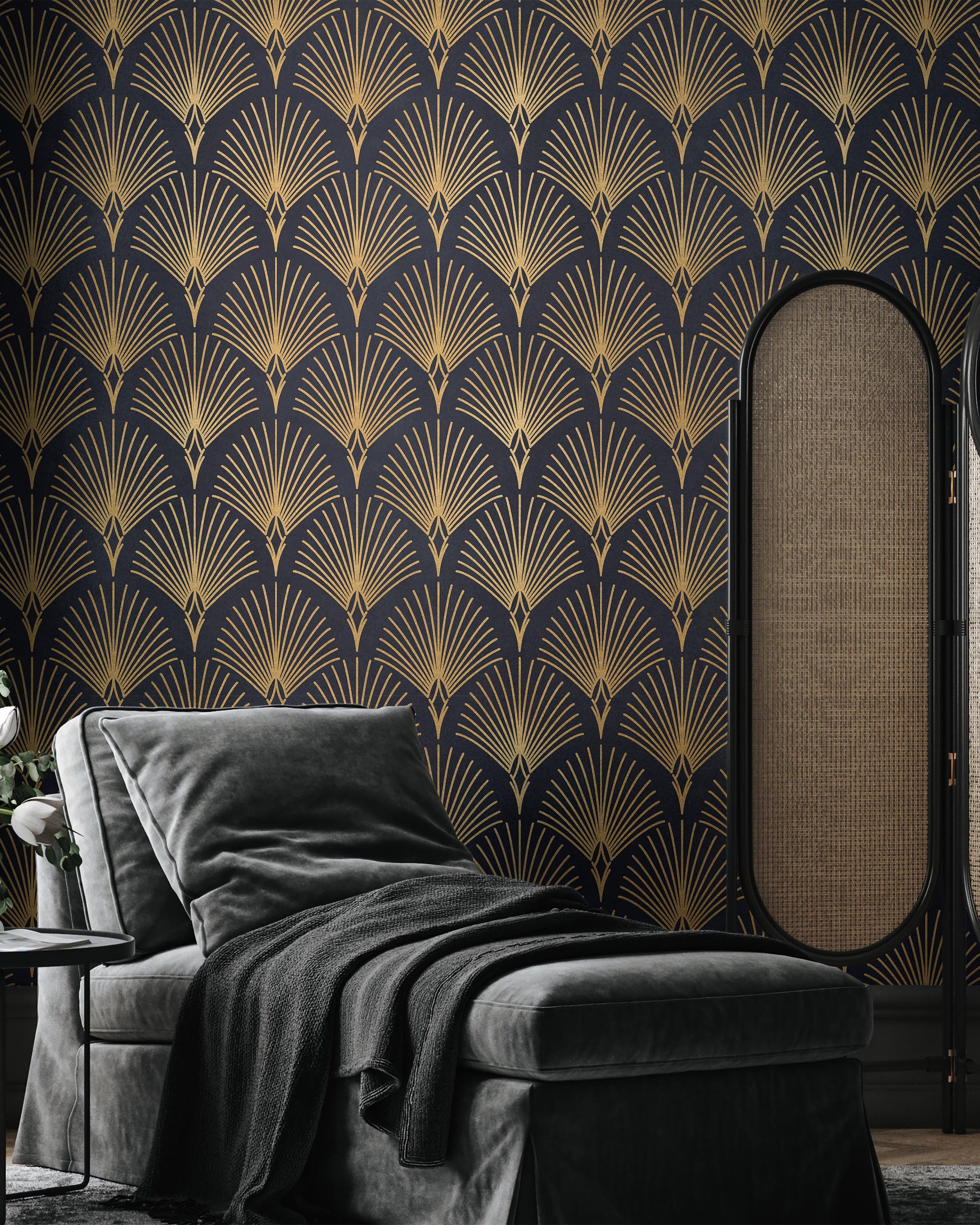
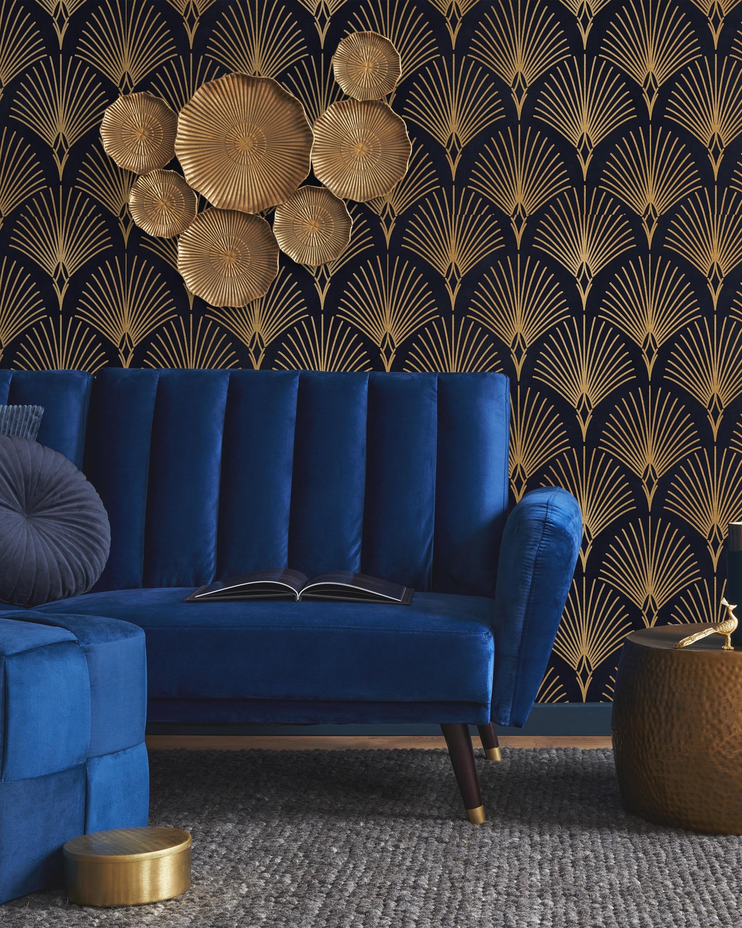
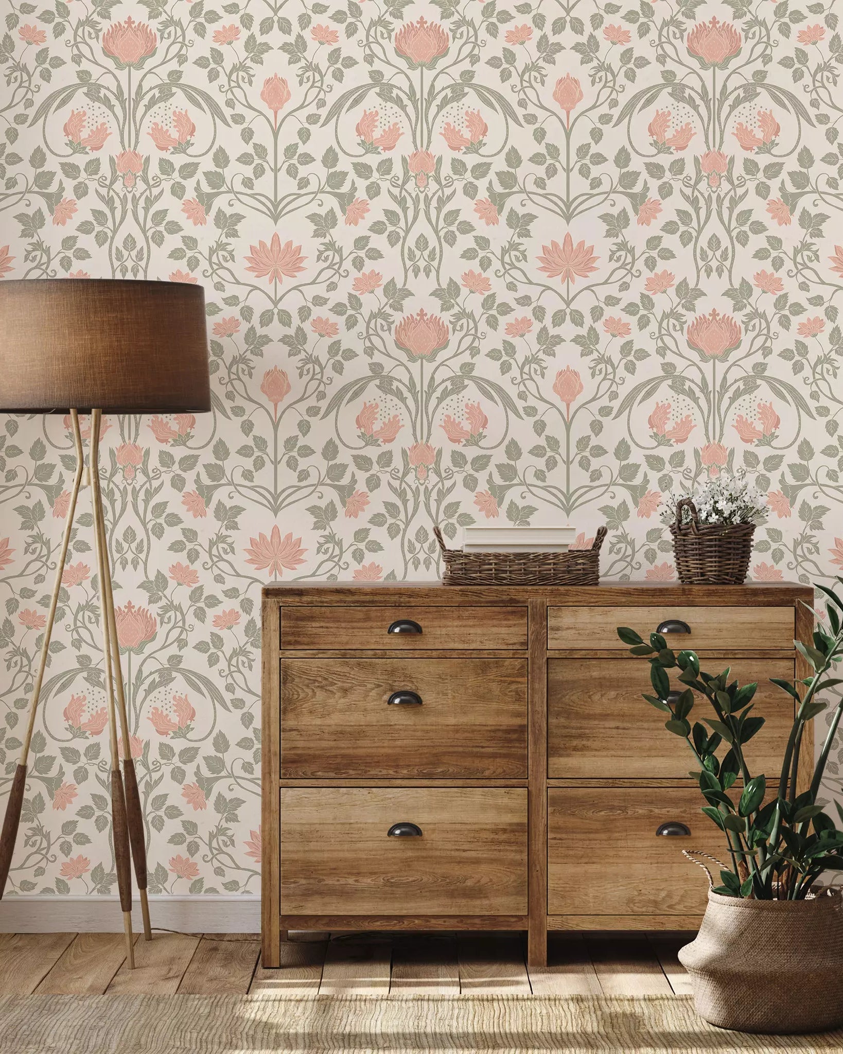
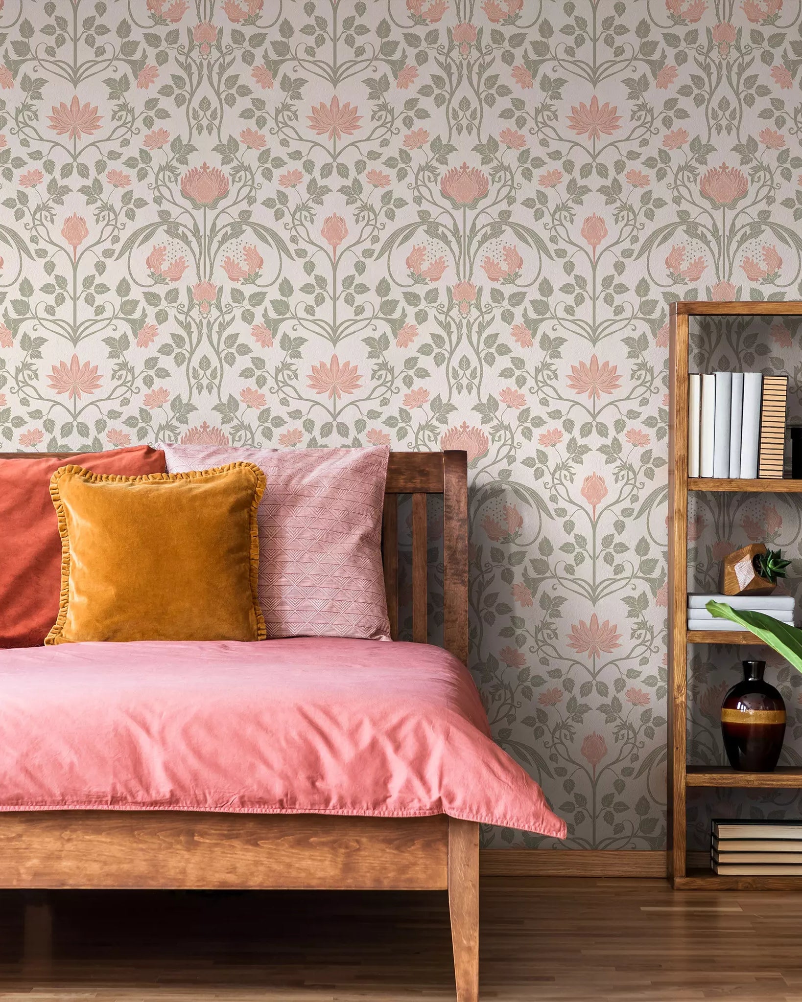
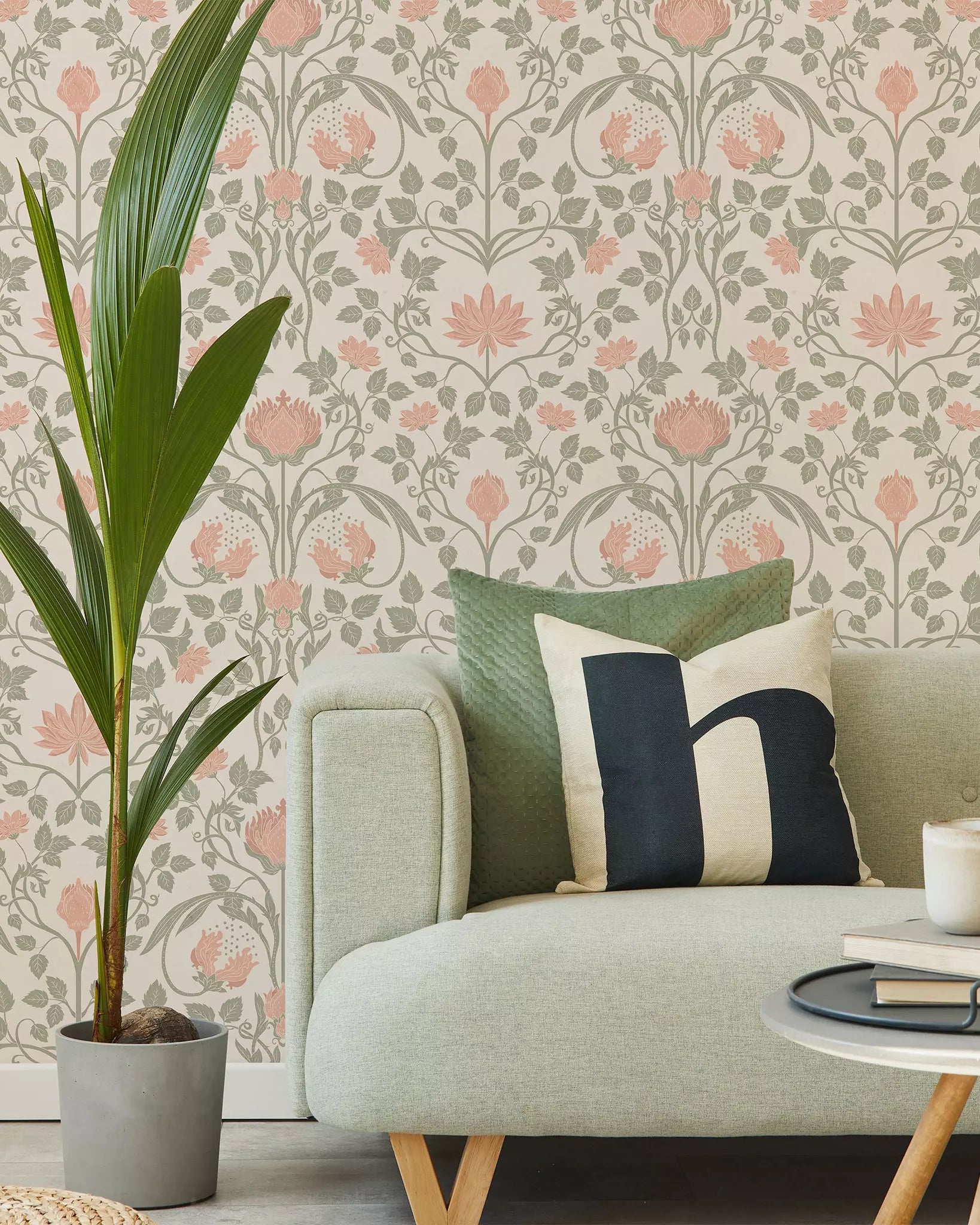
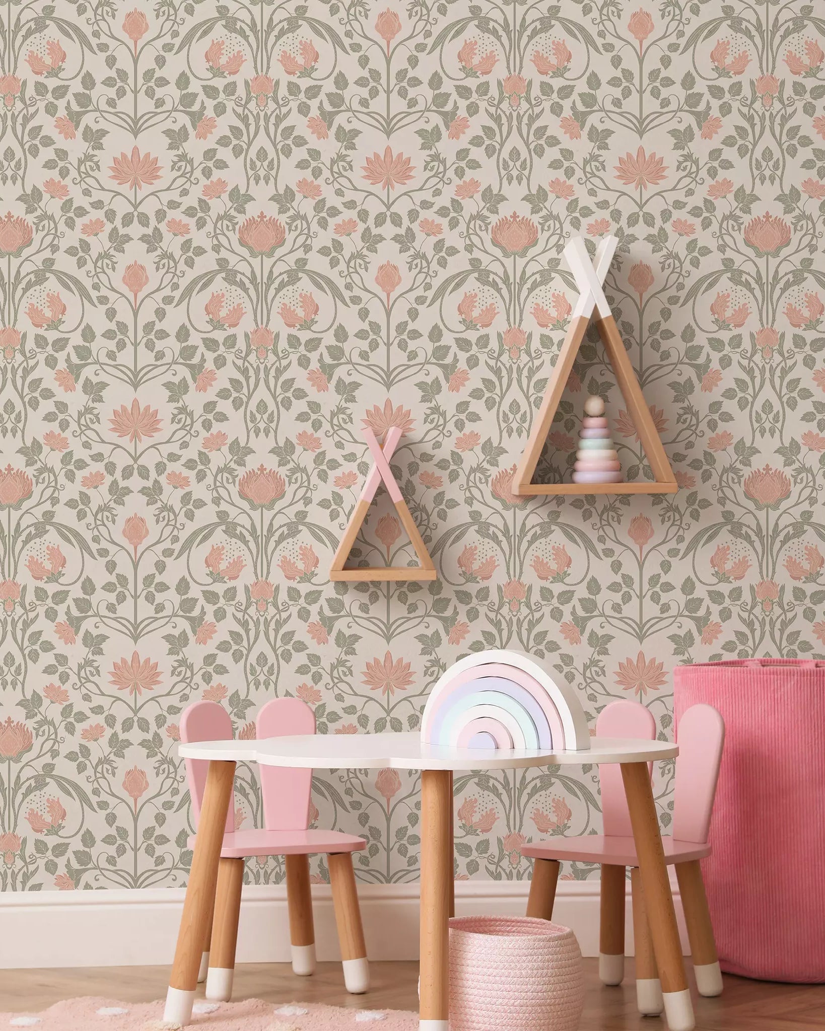
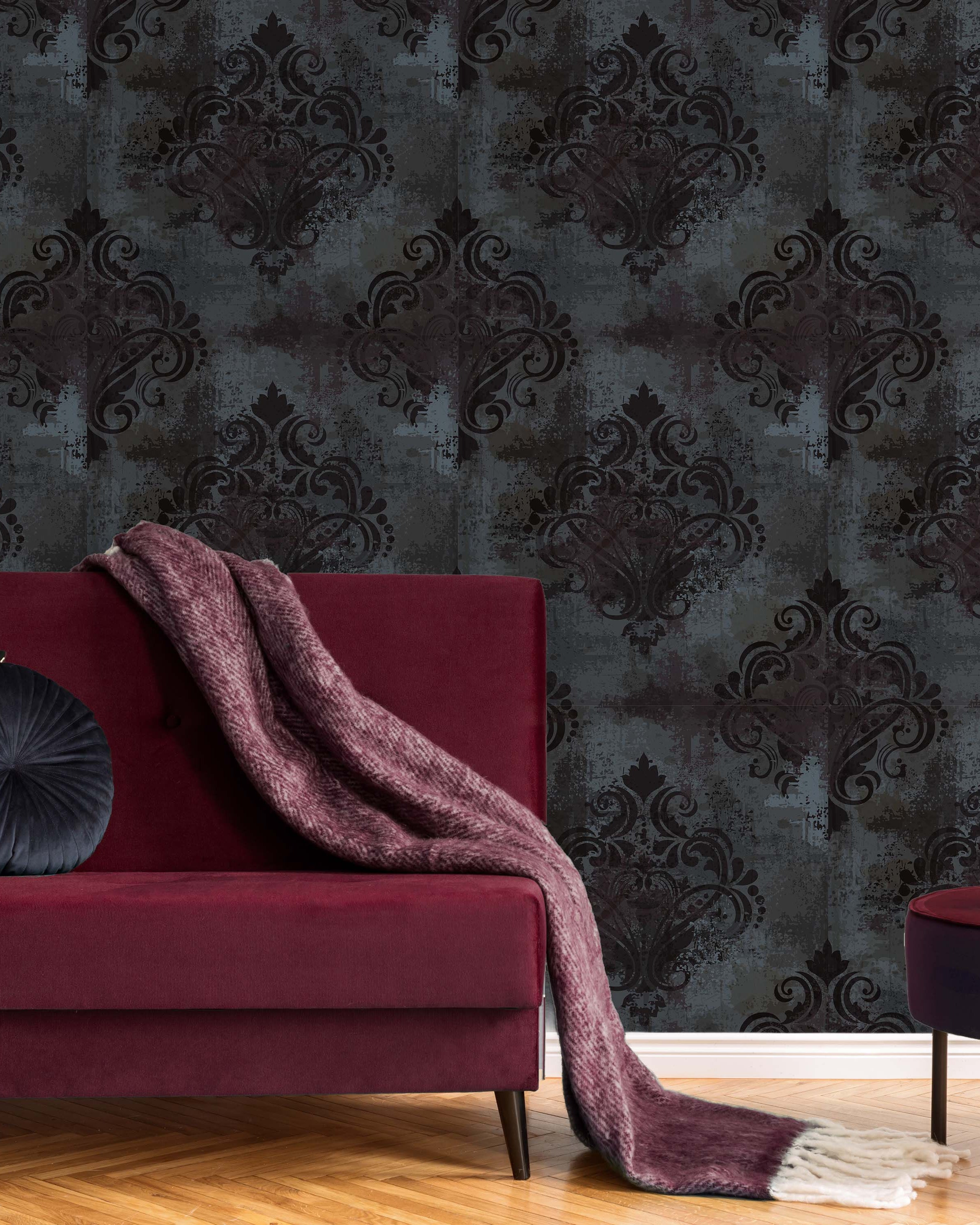
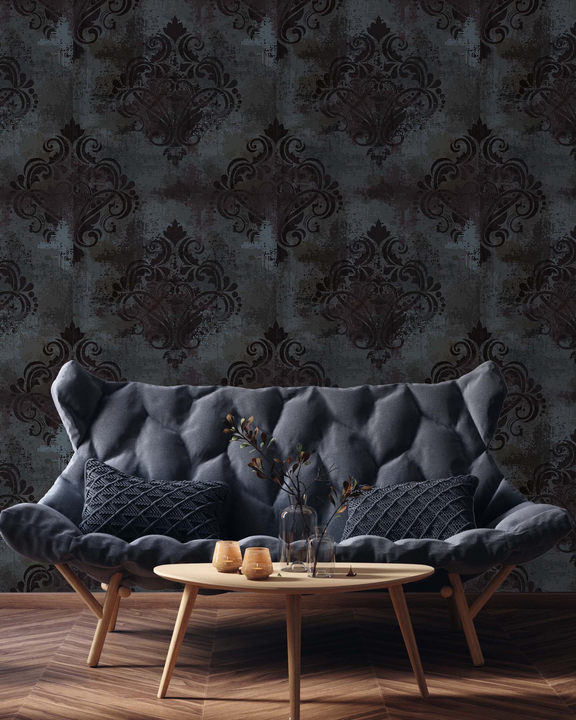
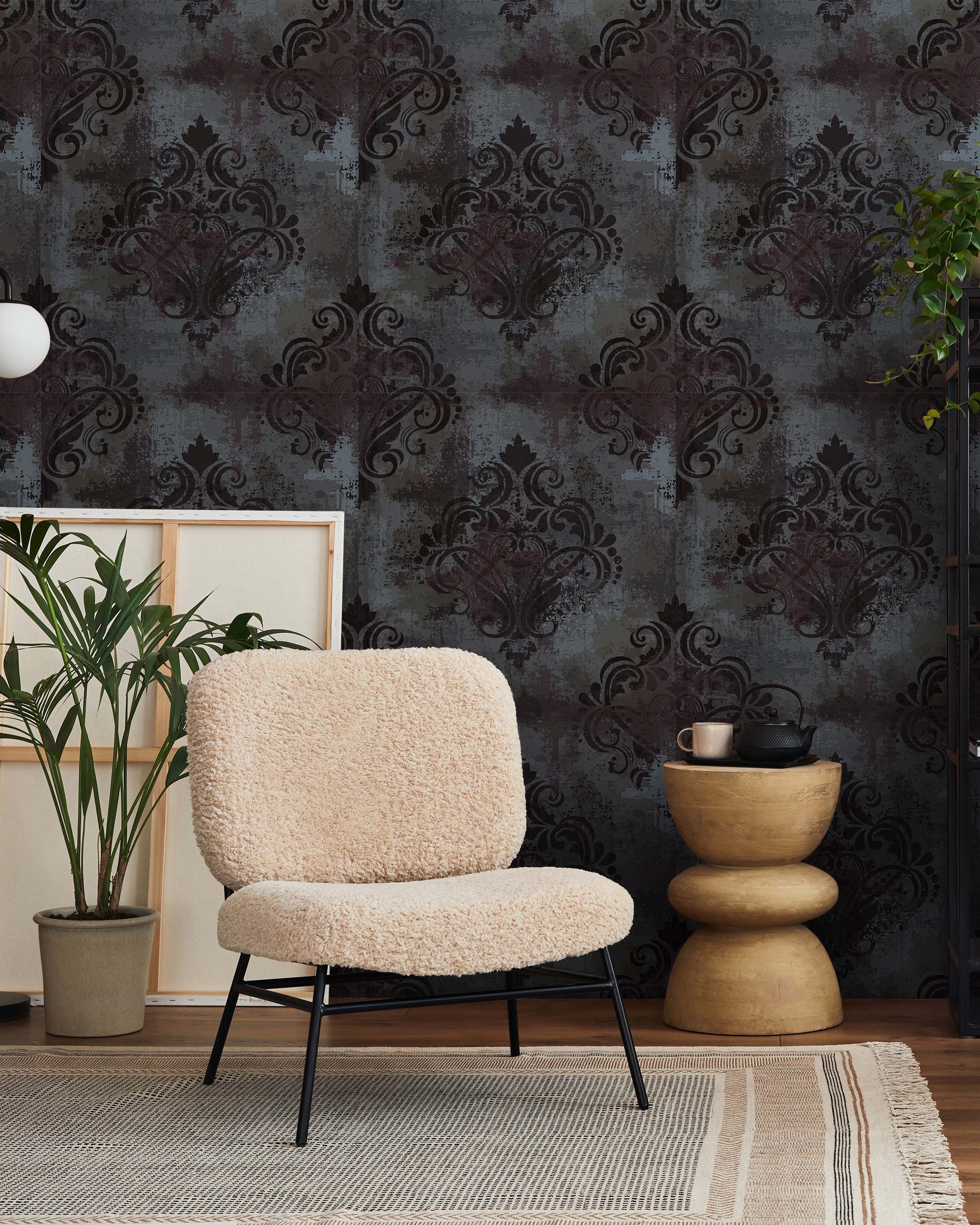
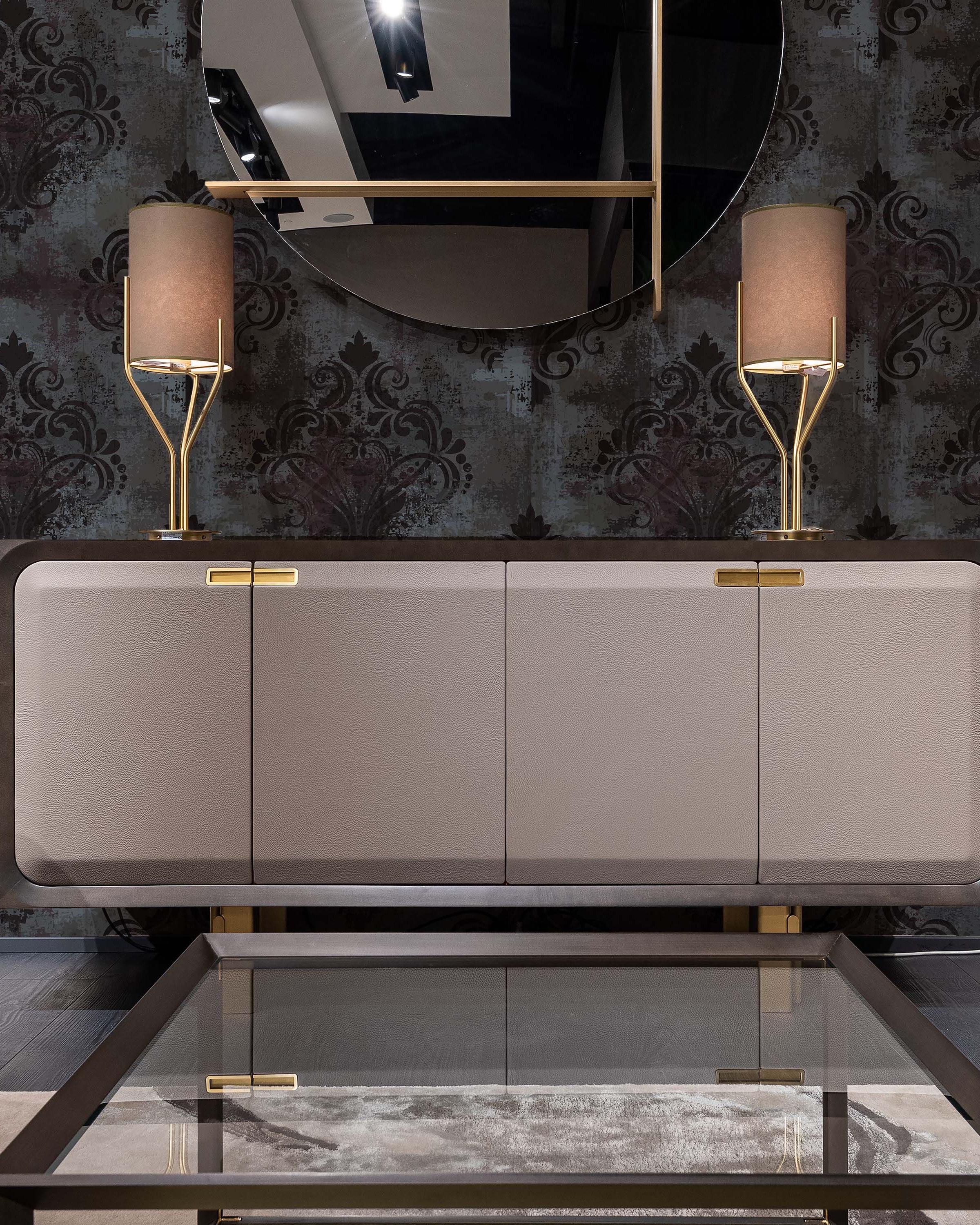
In the world of interior design, achieving balance means understanding how to make a room feel peaceful and put together. When a room is well-balanced, it makes you feel comfortable and relaxed as soon as you walk in. It's a delicate dance between elements where everything in the room – the furniture, colors, and decorations – work together to create a beautiful and harmonious look.
Symmetry is the simplest way to achieve a balanced look
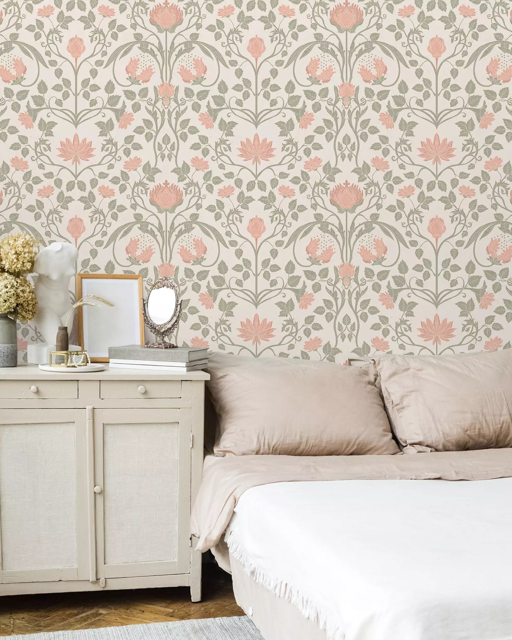
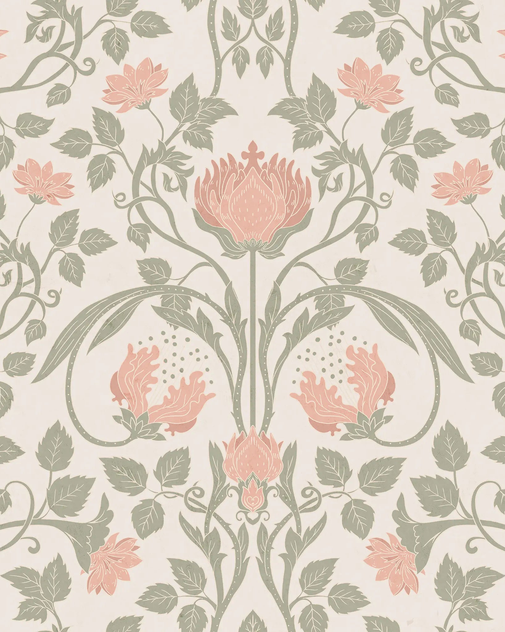
The human mind is made in a way that we always look for balance and symmetry. That’s why symmetrical designs make our brains feel good and we recognize symmetry as something beautiful.

Linear symmetry at home
Linear symmetry is great for achieving a put-together look of the room. The only downside – it can look a little bit too formal. To avoid that (for a home) add a little bit of unexpected decor and personal items here and there.
To achieve linear symmetry in interior design, imagine you have a straight line in the middle of the area you are designing. Then see one side as the mirror of the other and arrange things in a manner so that both sides look like a reflection.
Here are some examples:
Symmetrical bedroom design
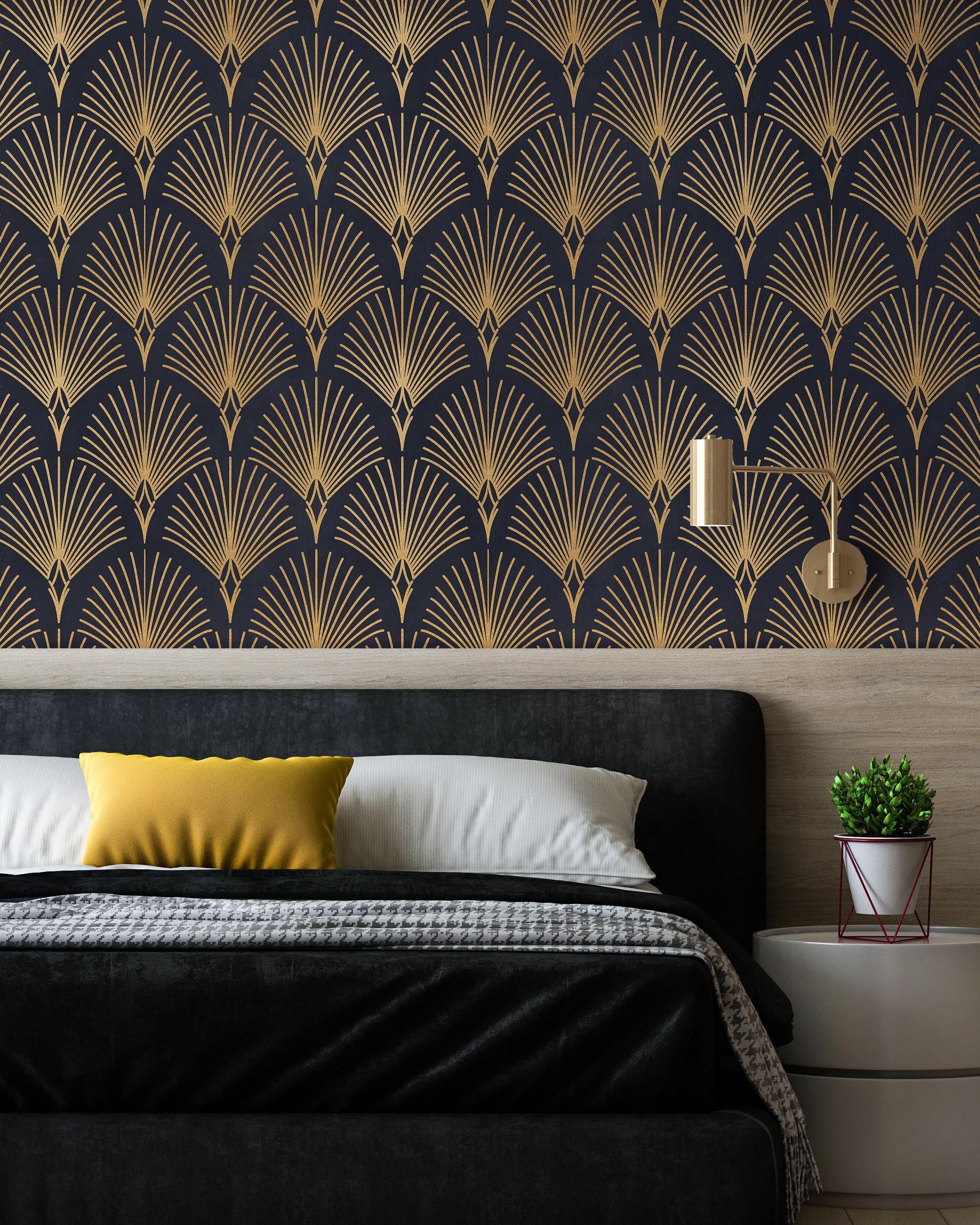
Have the bed as a focal point and add identical items to both sides of the bed – identical nightstands, lamps, shelves as well as pillows. It’s perfect if you can have the ceiling lamp right in the middle of the composition.
Once you have the big items arranged in a symmetrical style, experiment a little to make the room feel more alive. Add a few asymmetrical decor elements but make sure you don’t go overboard so you don’t throw off the symmetrical balance.
Symmetrical living room design
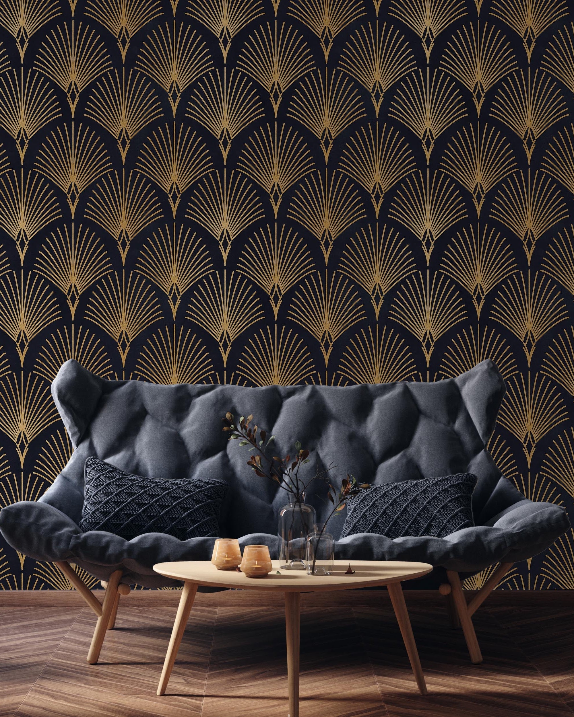
The golden rule for symmetry is pairs. Have everything in pairs and you will have a symmetrical look in no time! When it comes to the living room it all depends on the size of your room and the functionality of it. If the space allows it you can have a coffee table in the middle and have two sofas on either side of the coffee table. Add two side tables, lamps, and armchairs on either side to finish the look. To mix it up, a slightly different throw pillow arrangement is perfect for adding a bit of personality, but not messing up the symmetry.
Radial symmetry
Radial symmetry means that instead of a line you imagine all your decor radiating out from one place on a circular structure – like a wave when you throw a pebble into the lake. Radial symmetry is perfect for a dining space with a round table. It creates a good impression, it has a little bit of a formal feel but not as much as linear symmetry and you can surprise your guests with an interesting layout of decor items.
Radial symmetry in the dining room
A round dining room table will be a good start for radial symmetry. Pair it with a round rug underneath and add a ceiling lamp in the middle of the dining room table. Then arrange chairs around the table in a symmetrical manner, and add a centerpiece in the middle of the table. You can go further and add other decors in a radial symmetry as well.
Asymmetry
Asymmetry is a great option if you feel like symmetry is a little bit too stiff for your taste. Asymmetry can bring that balance into your room without having to have everything in pairs. How does it work? You see asymmetry as balance scales. An element has to be balanced with another element. The items don’t have to be identical but they need to work together well.

Asymmetry doesn’t mean that you put all design elements or furniture in one corner and leave the rest of the space empty. It’s rather finding how to use design items of different visual weights to feel like a joint experience.
Balance the colors – the 60-30-10 rule
When decorating a room and making it balanced and appealing to the eye, not only the furniture and the decor layout plays a role. Colors can also help create the desired look. Or just the opposite – incoherent colors can make even a room that’s arranged symmetrically feel chaotic.
To achieve a great color balance in the room, follow the 60-30-10 rule. It is a percentage distribution between the three main tones of the space.
It means that 60% of the room is in one color. It is the main color of the room. It is the color of the walls, maybe the couch is in this color as well as the rug or some furniture.
The next color you use in the room should make up 30% of the room interior. In this category are items like chairs, a couch, curtains, and other furniture.
And the rest, the 10% are the accent color. It pops up in items like art, pillows, decorative objects, etc.
How to use the 60-30-10 rule
Choose 3 tones that go well together. For example, green, white, and gold. Let’s choose green as your base color. So you color the walls green and maybe use green wallpaper to achieve a more interesting look. You can also add a green rug or green sofa.
White would be your secondary color. It will be perfect for an armchair, coffee table, or curtains. You can also experiment with having an item with a green and white print, mixing the two colors.
And last but not least, add a splash of accent color with gold details. It could pop up in furniture handles, picture frames, pillows, and decor.
To make a room feel multidimensional and cozy, don’t fixate on one specific tone for each color. Explore the options! For example, you can choose dark green, medium green, and light green. Just make sure they all are shades or tints from one color. That way they will match very well with each other.
Divide a room into zones
If you are dealing with a large room or you need to use it for different purposes feel free to divide it into different zones. For example, a living room can also act as a dining room or workspace. To avoid looking at it as a room without a distinct purpose, create specific zones.
Balance is found not only in colors and shapes but also in functionality. When you divide a room you give different zones a purpose which makes a room feel intenful and thought out.

Play with different levels
A room is not a flat 2D drawing. It has 3 dimensions and when creating a balanced look you need to take that into account. You can use furniture of different heights, paintings, light fixtures, and decor elements to bring out the different levels of a space.
For example, a couch and armchairs are on one level. Add a tall floor lamp to bring attention to the middle line. A bold ceiling lamp on the other hand can help balance the dead space near the ceiling, but a plant on the floor will bring attention to the floor level. You can also use shelves of different heights and other interior elements.
The goal is to evenly distribute weight across the room in all 3 dimensions. When that is achieved, a room will look put together and very well balanced. Which will make it cozy and appealing to the eye.
Negative space
A good rule for balance is all in moderation. Think about how you position elements in the room, what color are they, and what height. But also remember to leave some space to breathe. That space is called the negative space.
It is the part of the wall that is not heavily decorated, it is the space between decor items, it is a clean surface without any decors and it is the part of the floor that is not covered in rugs. To have a balanced feel, spread out these negative spaces throughout the whole room. If you batch them all in one area, you get another effect that’s called a dead space.
Dead space
Dead space creates a feeling that something is off in the room. It feels like the scale would tip over because there is so much decor clustered together in one space, but nothing in other spaces. To compare, a negative space gives a room space to breathe when a dead space leaves you wondering, is there something missing?
In conclusion
Balance in a room is all about finding the right proportions. Think about all the tools interior design can offer – shapes, sizes, styles, colors, and arrangements. Put them together in a logical and deliberative way and you will get a balanced room. And remember, even though there are certain rules you can follow to achieve what you are looking for, there is always room for creative splashes and gut feelings. Keep the guidelines in mind but decorate the way you feel right!
